Netric: Rebranding
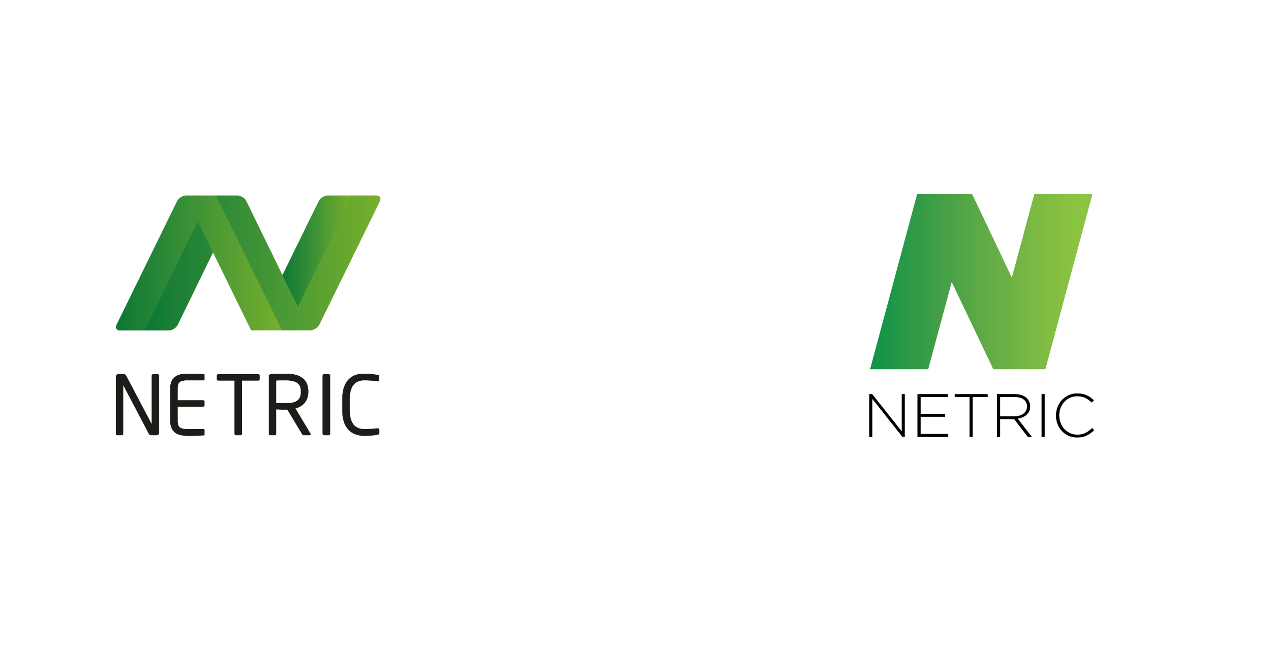
Netric was looking to refresh its branding, with an updated design to reflect a company working at the forefront of technology across the Nordics.
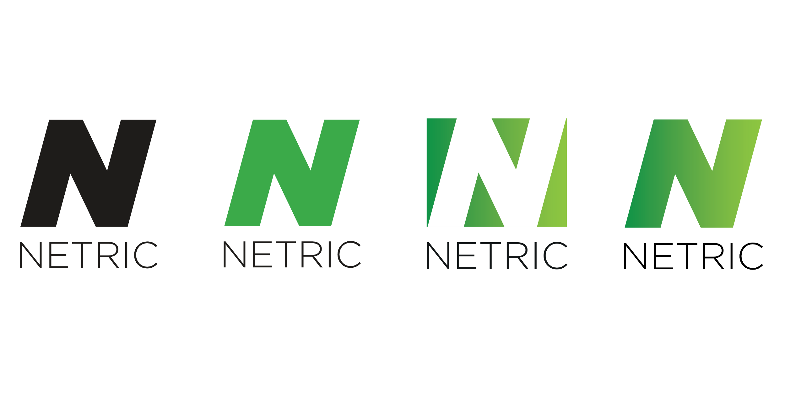
A subtle update to finesse both logo and type was chosen, giving the company an up to date look, as well as keeping it recognisable and consistent with the past.
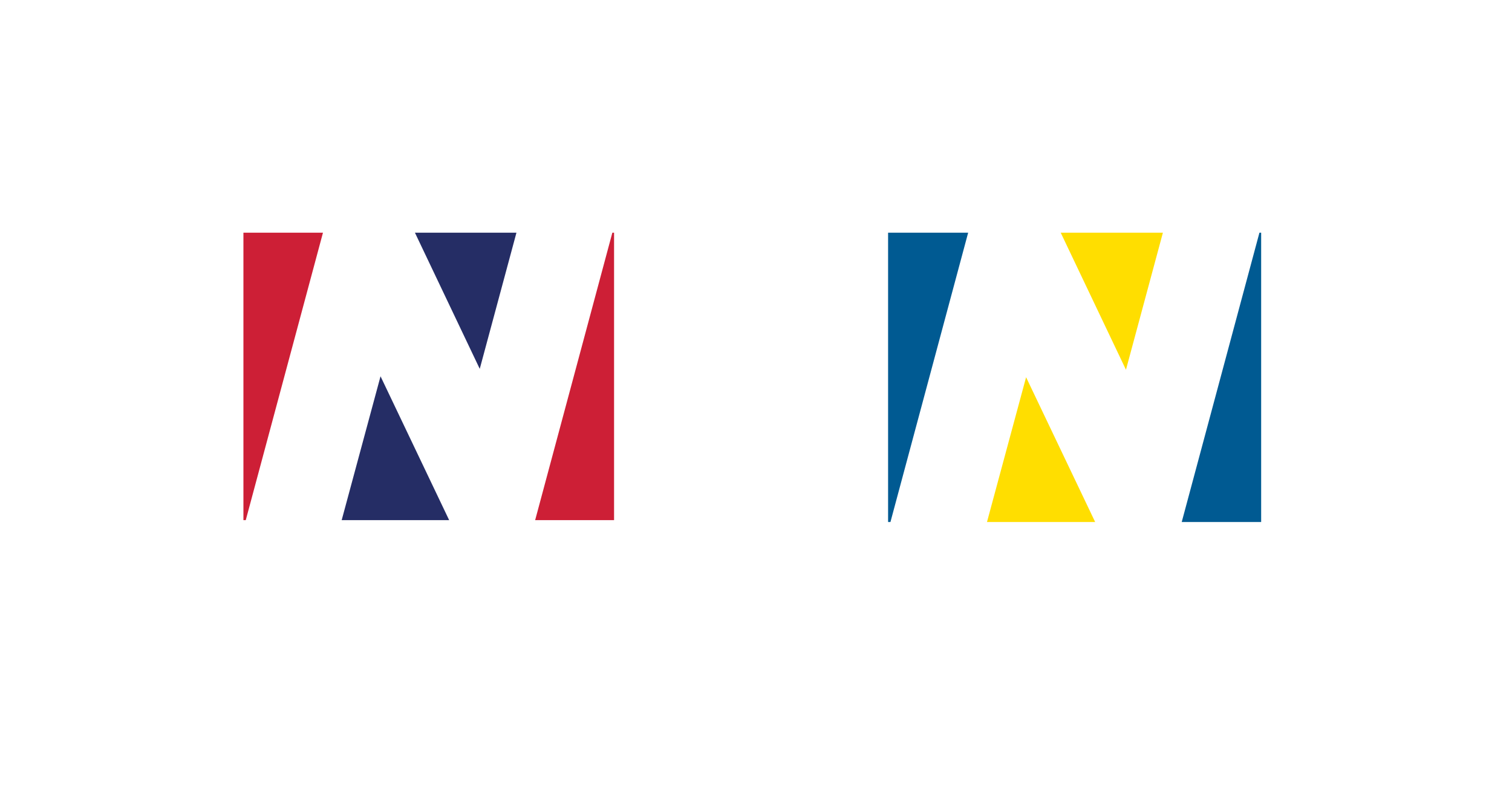
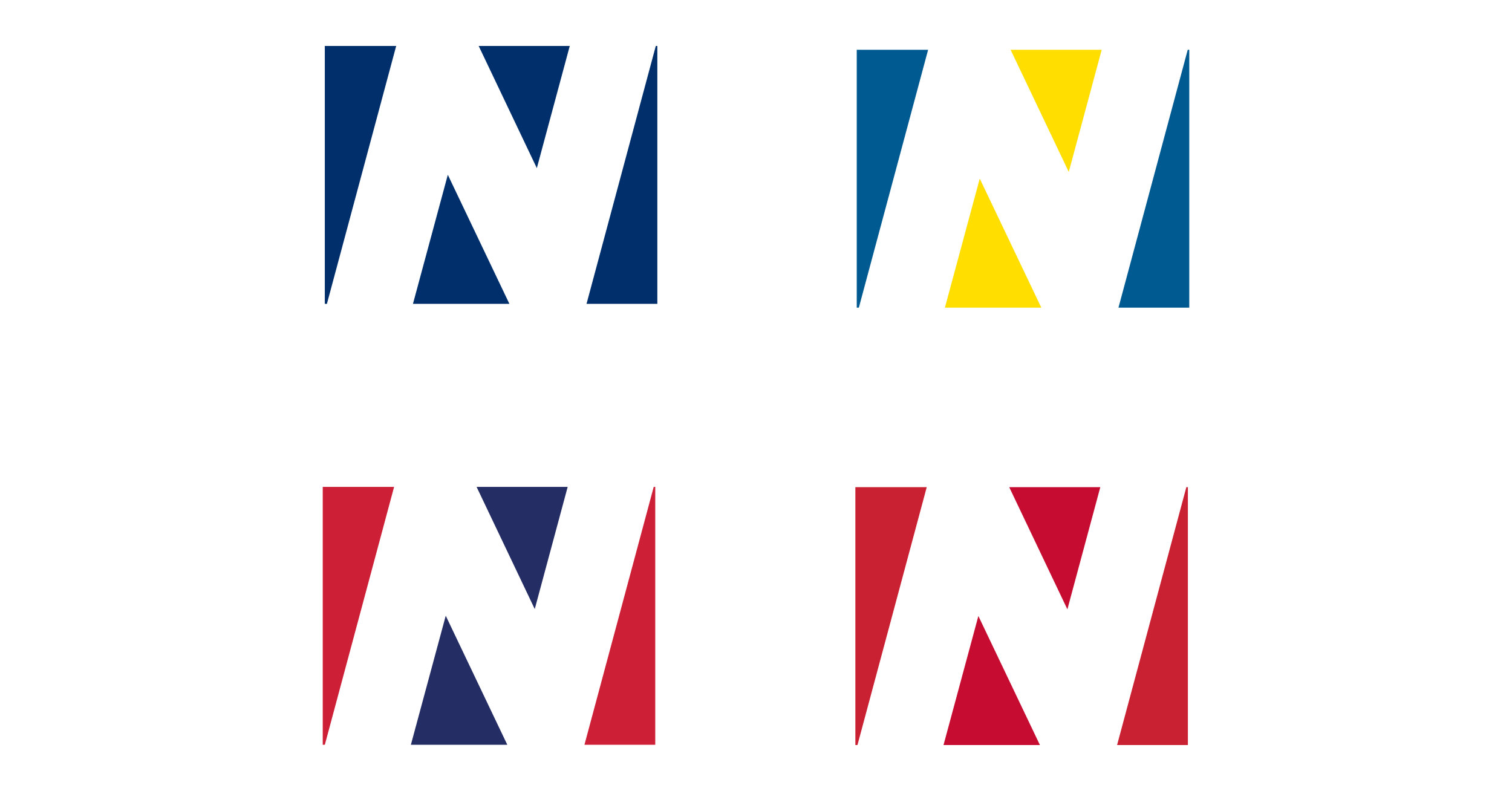
The redesign also included greater options and flexibility for the future, as reflected in the multiple country flag versions of the Netric ’N’, reflecting its varied work and clients across each of the four Nordic markets.


